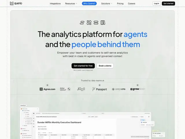
AI-native BI: ask in plain English, get governed SQL, charts and dashboards from 750+ sources. Flat rate from $1,000/mo.
basedash.com
79 tools found
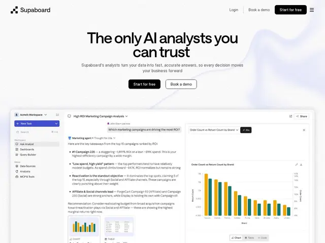
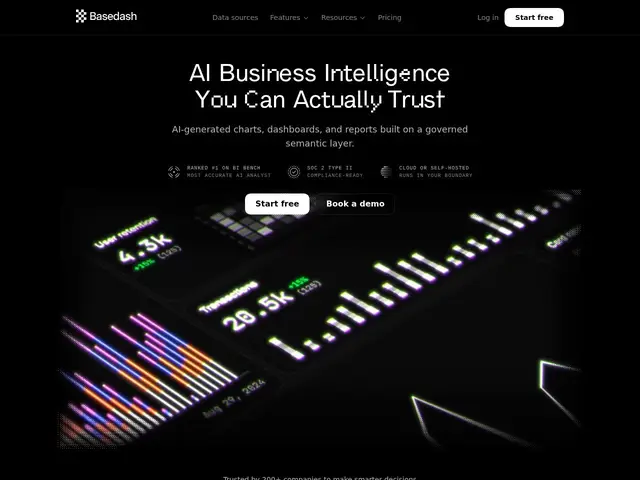
AI-native BI: ask in plain English, get governed SQL, charts and dashboards from 750+ sources. Flat rate from $1,000/mo.
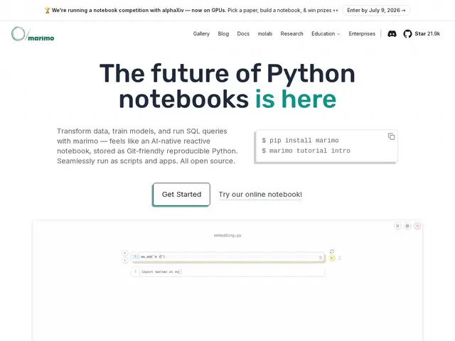
Reactive Python notebook stored as pure .py files: no hidden state, Git-friendly, SQL built in, deploys as apps or WASM.
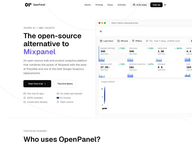
Open-source product + web analytics: funnels, cohorts, session replay and revenue tracking, self-hostable for free.
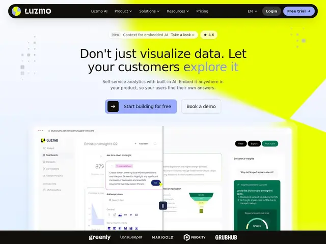
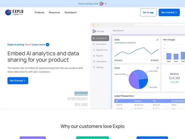
Embedded analytics platform that lets SaaS products add self-service dashboards and AI-powered analytics directly inside their own app.
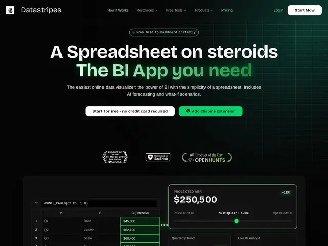
AI you can just talk to about your spreadsheet — upload a file, ask a question in plain English, and get back a chart, a trend, or a forecast without writing a formula.
A conversational BI tool that turns plain-English questions into SQL and answers them directly from your live data warehouse.
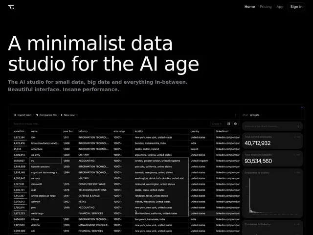
A spreadsheet that can quietly run real SQL underneath — load millions of rows, ask a question in plain English, and let the AI turn it into the right query and a live report.
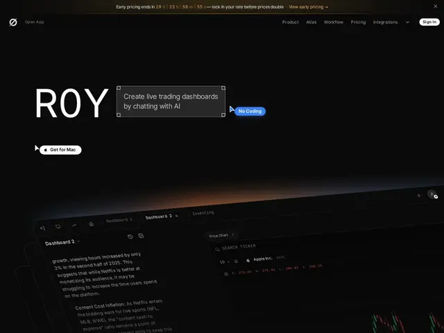
Lets you type a plain-English question like "how would my portfolio have done in the last recession" and get back a live, interactive financial dashboard — instead of building the chart yourself in a spreadsheet or a trading terminal.
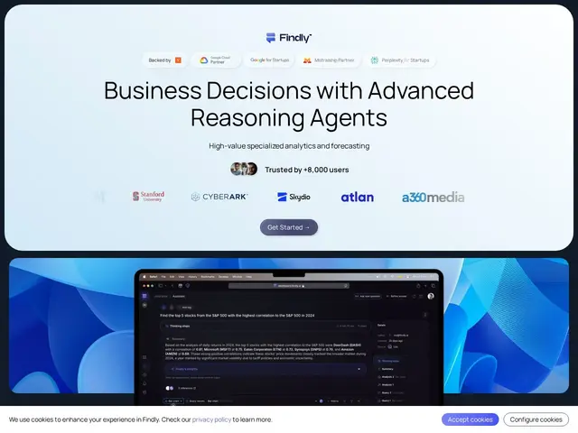
Instead of learning SQL or waiting for someone on the data team to build a chart, Findly lets a supply chain manager or trader type a plain-English question about their data — "how did shipping costs change last month" — and get back an answer, a chart, a
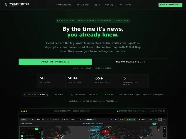
A free, live world map that pulls together hundreds of news feeds and turns them into a single dashboard showing where things are heating up around the globe, instead of you checking dozens of news sites separately.
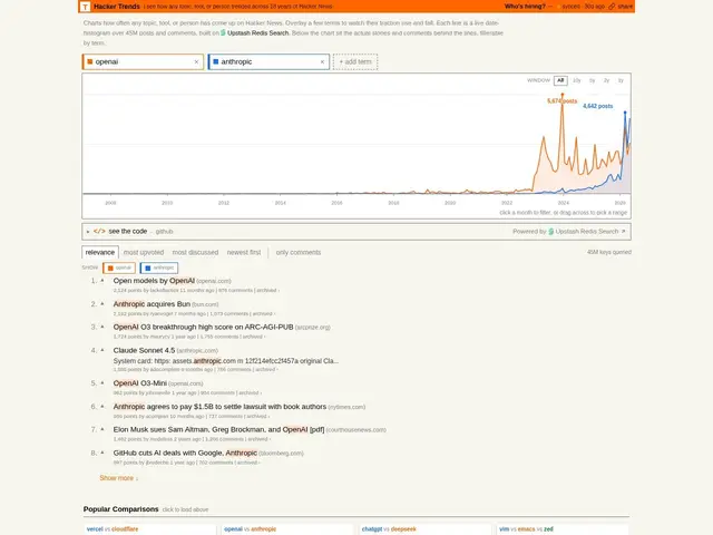
Type in any word — a tool, a company, a buzzword — and see a chart of exactly when it started (and stopped) being talked about on Hacker News, going back 18 years.
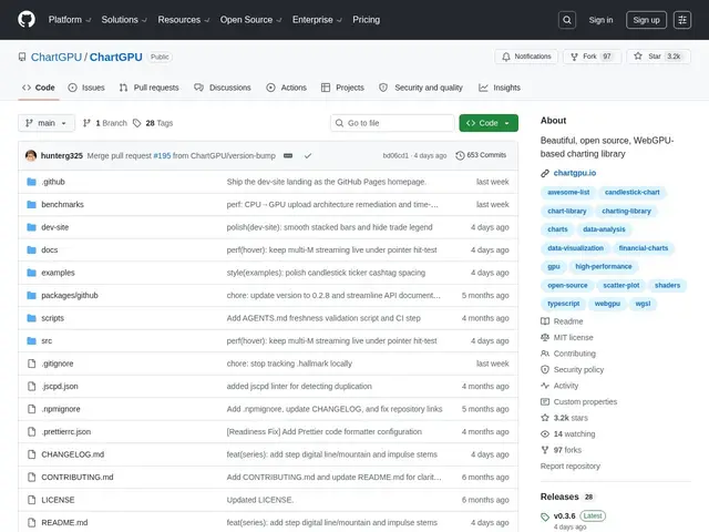
An open-source TypeScript charting library that uses your GPU to render 50 million+ data points smoothly.
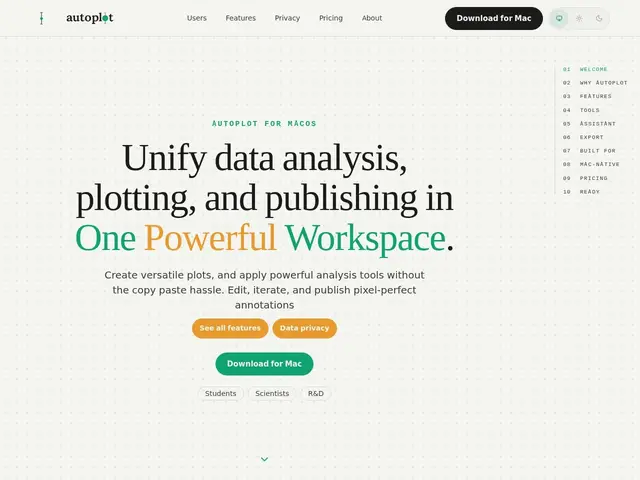
A Mac app for turning spreadsheets of numbers into publication-ready charts and figures — built for researchers and students who currently juggle a spreadsheet, a plotting script, and a separate export step just to get one clean graph for a paper.
AI-powered business intelligence platform that transforms data into interactive dashboards and insights through natural language queries. Enables organizations to ask questions about their data in plain English without technical setup.
A toolkit that lets software companies show their customers nice-looking charts and dashboards inside their own product, without building that from scratch.
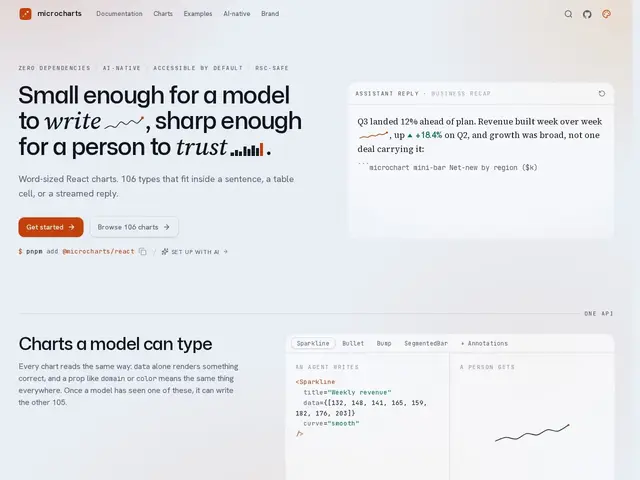
A free React library for making tiny, lightweight charts — small enough to sit inside a sentence or a table cell — with zero extra dependencies.
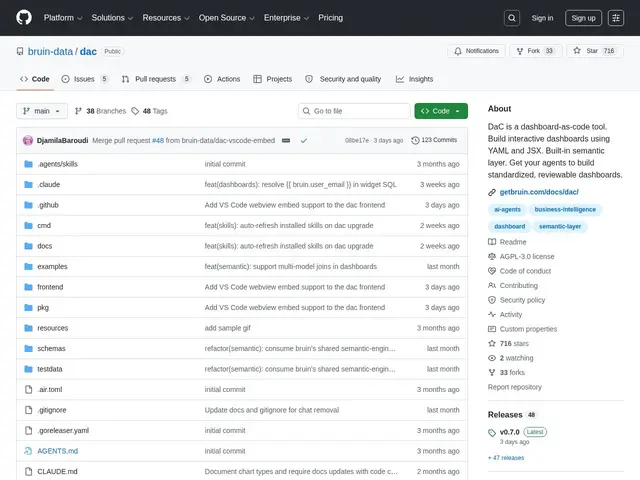
A tool that lets you write a company dashboard the same way you write code — in text files you can save, review, and hand to an AI assistant to edit — instead of clicking around a chart-builder UI.
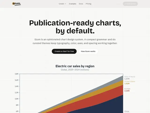
Write one JSON description of a chart and get the same chart, styled consistently, in your app, in Figma, and in a Slack message — no re-styling required.
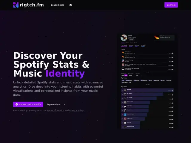
A Spotify Wrapped you can check any day of the year, going far beyond the 50-track limit Spotify itself shows you, with weekly and yearly breakdowns of what you've actually been listening to.
Open a browser tab, drag and drop your spreadsheet or database in, and build a chart or dashboard by connecting boxes together — no software to install, no analyst to hire.