Arena
An open-source design system that gives React and Angular teams the exact same set of components, so a button looks and behaves identically no matter which framework built it.
🔗 Visit Arena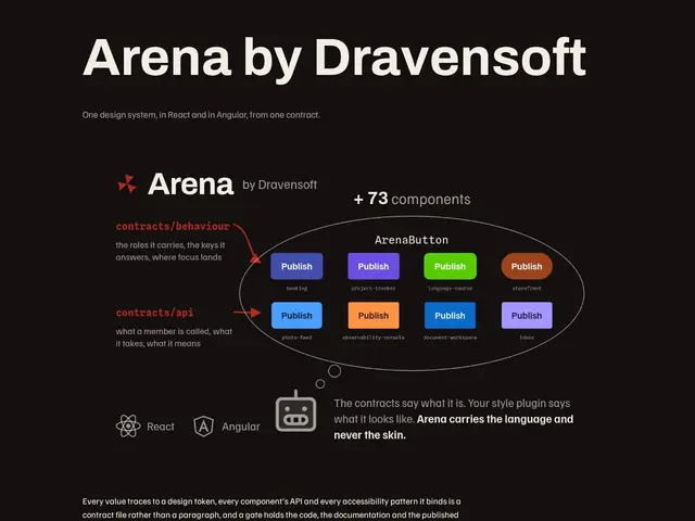
Description
Companies that maintain both a React app and an Angular app (common after acquisitions or team splits) usually end up with two different design systems that drift apart over time — the same button ends up looking subtly different depending on which team built it. Arena tries to remove that drift by giving both frameworks the exact same components from a single source.
Arena is an open-source design system providing 73 components that render pixel-identically in both React and Angular, built around contract-driven component APIs and enforced accessibility patterns. Styling is controlled through design tokens rather than scattered CSS, and teams configure palettes and fonts through a single arena.config.json file to keep customization consistent across both frameworks. Documentation includes 8 reference implementations that mirror the UI patterns of well-known products, giving teams a concrete starting point rather than an abstract component list.
💬 Our review
The short version: Arena solves a specific, real pain — keeping design consistent across React AND Angular — that neither Material-UI nor Chakra UI actually address, since both are single-framework libraries.
Material-UI and Chakra UI are the standard choices for teams on a single framework, and they're more mature with larger ecosystems, but neither helps if your organization runs both React and Angular codebases; you'd otherwise need two separate component libraries and accept visual drift between them. Arena's 73-component, contract-driven approach is a genuinely different value proposition — cross-framework parity — rather than trying to out-feature the single-framework incumbents. Being MIT-licensed and free removes the cost barrier to trying it. The real limitation is scope: it only covers React and Angular, so Vue or Svelte shops get no benefit, and the dependency on @phosphor-icons/web is a small but real integration tax. For a genuinely multi-framework org, it's worth a serious look; for anyone on a single framework, Material-UI or Chakra UI remain the safer, more battle-tested default.
📊 Global score
🤖 AI-enriched data
Open source (MIT), gratuit / auto-hébergé.
Pros
Source unique de vérité pour le design partagée entre React et Angular
73 composants pré-construits qui s'affichent de façon identique dans les deux frameworks
Licence MIT, entièrement open source, aucune restriction de licence
Documentation complète avec 8 implémentations de référence imitant des produits connus
Cons
Limité à React et Angular, pas de support Vue, Svelte ou autres frameworks
Dépendance requise au package @phosphor-icons/web