Flitch
AI dashboard builder: connect your data, describe what you want in plain English, and get a shareable analytics dashboard in minutes.
🔗 Visit Flitch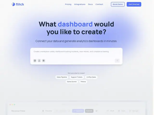
Description
Building a business dashboard the traditional way means picking a BI tool, learning its query language or drag-and-drop model builder, and then maintaining it as your data changes. Flitch skips most of that: you connect a data source (or let it start from a mock dataset), describe what you want to see in plain language, and it generates the charts, layout, and underlying queries for you — like having a data analyst who builds the first draft in one prompt.
Flitch is an AI-native dashboard builder with three steps: connect data (60+ integrations including Snowflake, BigQuery, PostgreSQL, HubSpot, Stripe, Salesforce, Airtable, Notion, Shopify, and Jira, or skip and use a mock dataset), describe what you want in one prompt, and inspect/share — every chart is traceable back to the underlying data so you can verify and correct it. It generates a real web application rather than a static export, supports 36 interactive chart types with cross-filtering, and includes scheduled reports, PDF/PNG/PowerPoint export, row-level security, and version history. The free plan includes 40 credits/month and up to 100 dashboards with 12-hour refresh; paid plans add faster refresh, more credits, SSO, and self-hosting at the enterprise tier.
💬 Our review
The short version: Flitch is genuinely useful if you want a working dashboard from a single sentence instead of a multi-day BI project, and the free tier is generous enough to actually try it properly before paying — worth it for teams that need dashboards often but don't have a dedicated data analyst on tap.
Hex and Basedash are the closest comparisons: Hex leans more toward notebook-style data science work, Basedash focuses on database-connected BI with governed AI chat, while Flitch's pitch is speed — go from a data connection to a shareable dashboard in one prompt, with 60+ integrations covering most common business tools out of the box. At $20/user/month for Pro, it's competitively priced against both, and the credit-based free tier (40 credits, up to 100 dashboards) is enough to build real workflows before paying. The tradeoff is that AI-generated dashboards from a single prompt can misinterpret ambiguous requests, so budget time to inspect and correct the first draft rather than trusting it blindly. Worth it for teams that generate a lot of one-off or recurring dashboards; a dedicated BI tool with a mature semantic layer may still be better for very large, complex data models. <!-- ai-generated -->
💰 Pricing
📊 Global score
🤖 AI-enriched data
Gratuit (40 crédits/mois) ; Pro $20/utilisateur/mois ; Business $40/utilisateur/mois ; Enterprise sur devis
Pros
génération de dashboard complet à partir d'une simple description en langage naturel
60+ intégrations (Snowflake, BigQuery, Stripe, HubSpot, Salesforce, Shopify...)
36 types de graphiques interactifs avec cross-filtering
plan gratuit généreux (40 crédits, jusqu'à 100 dashboards)
export PDF/PNG/PowerPoint, rapports planifiés, historique de versions
Cons
les dashboards générés par IA peuvent mal interpréter une demande ambiguë, nécessitent vérification
système de crédits peut devenir limitant en usage intensif
moins adapté aux modèles de données très complexes qu'un outil BI dédié mature