WorldMonitor
A free, open-source news dashboard that reads hundreds of feeds for you and shows what's happening around the world on an interactive 3D globe, instead of you scrolling through dozens of sites.
🔗 Visit WorldMonitor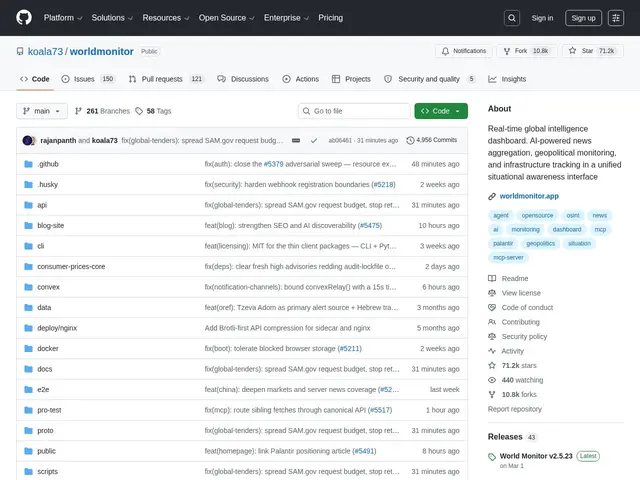
Description
Keeping up with world events usually means bouncing between news sites, Twitter/X, and specialist trackers, then mentally piecing it together. WorldMonitor is a self-hosted (or locally-run) dashboard that does that aggregation for you: it pulls from 500+ curated feeds across 15 categories, uses AI to synthesize short briefs, and plots what's happening on an interactive globe or flat map so you can see patterns geographically rather than as a scrolling list.
Technically, it ships with a dual map engine (a 3D globe via globe.gl and a WebGL flat map via deck.gl) supporting 56 map layer types, a Country Instability Index scoring 31 Tier-1 countries, and a finance radar covering 29 stock exchanges. It can run fully offline via Ollama integration, ships as native desktop apps (via Tauri 2) for macOS, Windows, and Linux, supports 25 languages with right-to-left text, and exposes an MCP server, REST API, CLI, and SDKs in Python, Ruby, and Go. It's built with Vanilla TypeScript, Vite, Three.js, deck.gl, MapLibre GL, and Rust (Tauri), and is licensed AGPL-3.0, with roughly 76.4k GitHub stars at time of writing.
💬 Our review
The short version: for anyone who wants a birds-eye, geographically-organized view of world news instead of a text feed, WorldMonitor's map-first approach and offline-capable AI summarization is a genuinely different way to consume the same information, and it costs nothing.
Compared to commercial geopolitical intelligence platforms (Stratfor, Recorded Future), which charge substantial subscription fees for similar synthesis, WorldMonitor is free and self-hostable, though you're trusting a community open-source project's feed curation and AI summaries rather than a paid analyst team's judgment calls. Against just using Google News or a Twitter list (also free), WorldMonitor's structured indices (Country Instability Index, finance radar) and map visualization add real analytical value if you actually use them, but represent a steeper learning curve than a simple feed. The AGPL license and offline Ollama support make it a solid pick for privacy-conscious users or teams who want to self-host rather than depend on a cloud dashboard.
💰 Pricing
📊 Global score
🤖 AI-enriched data
Open-source AGPL-3.0, auto-hébergeable ou usage local, aucun coût
Pros
Gratuit et open-source (AGPL-3.0)
Visualisation carte 3D/2D avec 56 types de couches
Fonctionnement offline possible via Ollama
Index d'instabilité pays + radar financier intégrés
Apps desktop natives (Tauri 2) macOS/Windows/Linux
Cons
Curation communautaire des flux, pas d'équipe d'analystes payée derrière
Courbe d'apprentissage plus élevée qu'un simple flux d'actu
Projet individuel/communautaire, pérennité moins garantie qu'un service commercial